Frequency polygon calculator
Enter a table of classes and frequencies, or raw data, and the calculator lists the points to plot, closes the polygon at both ends and draws it over the histogram.
| Class | Boundaries | Midpoint (x) | f | Relative f |
|---|---|---|---|---|
| (closing point) | 4.5 | 0 | 0 | |
| 10–19 | 9.5–19.5 | 14.5 | 3 | 0.08571 |
| 20–29 | 19.5–29.5 | 24.5 | 7 | 0.2 |
| 30–39 | 29.5–39.5 | 34.5 | 12 | 0.3429 |
| 40–49 | 39.5–49.5 | 44.5 | 9 | 0.2571 |
| 50–59 | 49.5–59.5 | 54.5 | 4 | 0.1143 |
| (closing point) | 64.5 | 0 | 0 |
Show the working, step by step
Find each class midpoint: (lower limit + upper limit) ÷ 2.
(10 + 19) ÷ 2 = 14.5 (20 + 29) ÷ 2 = 24.5 (30 + 39) ÷ 2 = 34.5 (40 + 49) ÷ 2 = 44.5 (50 + 59) ÷ 2 = 54.5
Plot each midpoint against its frequency and join the points with straight lines.
(14.5, 3), (24.5, 7), (34.5, 12), (44.5, 9), (54.5, 4)
Close the polygon: add a point with frequency 0 one class width before the first midpoint and one after the last.
14.5 − 10 = 4.5, 54.5 + 10 = 64.5
Consecutive classes are 1 apart, so boundaries sit 0.5 outside each limit.
The formulas
midpoint = (lower limit + upper limit) ÷ 2 closing points: (first midpoint − w, 0) and (last midpoint + w, 0)
Here w is the class width, the distance from one lower limit to the next. With classes 10–19, 20–29 and so on, w = 20 − 10 = 10, not 19 − 10 = 9.
A worked example
The default table gives the minutes 35 students spent on homework one evening:
| Minutes | f | Midpoint |
|---|---|---|
| 10–19 | 3 | 14.5 |
| 20–29 | 7 | 24.5 |
| 30–39 | 12 | 34.5 |
| 40–49 | 9 | 44.5 |
| 50–59 | 4 | 54.5 |
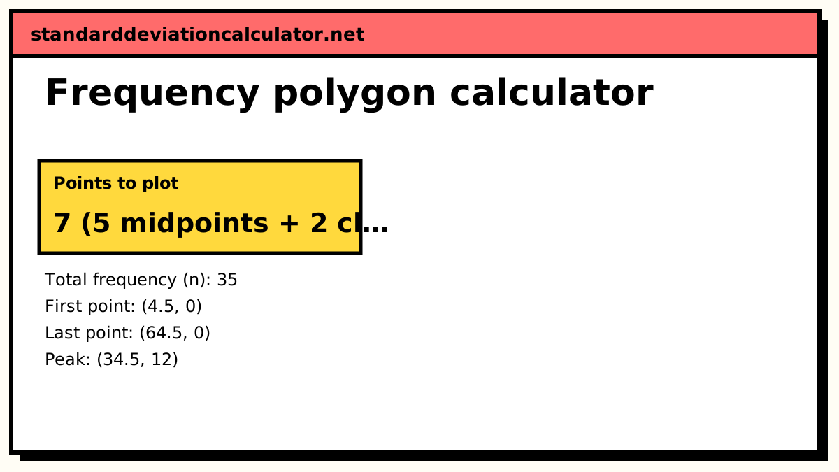
The first midpoint is (10 + 19) ÷ 2 = 14.5, and each one after it is 10 higher. The class width is 10, so the closing points are at 14.5 − 10 = 4.5 and 54.5 + 10 = 64.5. The seven points to plot are:
(4.5, 0), (14.5, 3), (24.5, 7), (34.5, 12), (44.5, 9), (54.5, 4), (64.5, 0)
Joined with straight lines, they form a single peak at 34.5 minutes. The frequencies add to 35, so switching to relative frequency divides every height by 35: the peak becomes 12 ÷ 35 = 0.343.
Interpreting the polygon
The peak shows the modal class, 30–39 minutes. The line rises from 3 to 12 over two classes and falls back only to 4 over the next two, so the right side holds a little more of the data: 13 students are above the modal class against 10 below it. Overall the shape is close to a single hump, with no second peak that would suggest two different groups of students mixed together.
Each point stands for a whole class, so the polygon does not claim that exactly 12 students did 34.5 minutes. It shows how the counts change from class to class, which is why it is useful for comparing the shape of two or more distributions on one set of axes.
Starting from raw data
If you have the individual values rather than a table, choose “Raw data”. The calculator groups the values first, by Sturges' rule unless you give a number of classes or a class width, and then plots the polygon through the new class midpoints. The default raw data is 25 commute times, which Sturges' rule puts in six classes of width 8 starting at 12. The first midpoint is (12 + 19) ÷ 2 = 15.5, so the polygon opens at 15.5 − 8 = 7.5 and closes at 55.5 + 8 = 63.5.
Common mistakes
- Plotting frequencies at the class limits instead of the midpoints.
- Leaving the polygon open, starting at the first midpoint and stopping at the last.
- Using 9 instead of 10 as the width for classes like 10–19, which puts the closing points in the wrong place.
- Comparing groups of different sizes with raw frequencies instead of relative frequencies.
Common questions
How do you draw a frequency polygon?
Find the midpoint of each class, plot each midpoint against the class frequency, and join the points with straight lines. Then add one extra point with frequency 0 a class width before the first midpoint and one a class width after the last, so the polygon starts and ends on the horizontal axis.
Why does a frequency polygon start and end at zero?
The empty classes on either side of the data have frequency 0, and plotting their midpoints closes the shape. A closed polygon encloses the same area as the histogram of the same data (with equal class widths), which matters when the polygon is read as a picture of the distribution.
What is the difference between a frequency polygon and an ogive?
A frequency polygon plots each class's own frequency at its midpoint, so it rises and falls with the data. An ogive plots cumulative frequency at each upper class boundary, so it only ever rises, from 0 to n.
How do I find the midpoint of a class like 20–29?
Add the lower and upper limits and halve: (20 + 29) ÷ 2 = 24.5. Using the boundaries, (19.5 + 29.5) ÷ 2, gives the same answer.
Why draw two frequency polygons on one graph?
Polygons are easier to overlay than histograms, whose bars would hide each other. To compare two groups of different sizes, plot relative frequencies so both polygons are on the same scale.
Related calculators
-
Histogram calculator
The bars that a frequency polygon joins at the top.
-
Frequency distribution
Build the class table from raw data first.
-
Grouped data SD
Mean and standard deviation from the same class table.