Dot plot calculator
Enter your data to draw a dot plot, one dot per observation stacked above its value. The calculator also counts each value and reports the mode, mean, median and range.
Separate values with commas, spaces or new lines. 5:4 means the value 5 four times.
Leave blank to plot every value exactly. Rounding helps when the data has many decimals.
One dot per observation, stacked above its value.
| Value | Count | Dots | Share |
|---|---|---|---|
| 2 | 1 | ● | 7.143% |
| 3 | 2 | ●● | 14.29% |
| 4 | 3 | ●●● | 21.43% |
| 5 | 4 | ●●●● | 28.57% |
| 6 | 2 | ●● | 14.29% |
| 7 | 1 | ● | 7.143% |
| 9 | 1 | ● | 7.143% |
Show the working, step by step
Draw a number line covering the smallest to the largest value.
2 to 9
Count how often each value occurs and stack that many dots above it.
2: 1, 3: 2, 4: 3, 5: 4, 6: 2, 7: 1, 9: 1
The tallest stack is the mode.
mode = 5 (4 times)
The median is the middle dot counting from either end; the mean is the balance point.
median = 5, mean = 68 ÷ 14 = 4.85714
Axis: Books read last month.
How a dot plot is built
There is no formula for the plot itself, only a count. For each distinct value x, the stack height is its frequency:
height of stack at x = f(x) = number of observations equal to x total dots = Σ f(x) = n
The summary numbers come from the same counts. The mean is Σ x·f(x) ÷ n, the mode is the x with the largest f(x), and the median is the value of the middle dot.
A worked example
The default data is the number of books 14 students read last month:
2, 3, 3, 4, 4, 4, 5, 5, 5, 5, 6, 6, 7, 9
Counting gives one 2, two 3s, three 4s, four 5s, two 6s, one 7 and one 9, so the stacks are 1, 2, 3, 4, 2, 1 and 1 dots tall, and they add to 14. Nobody read 8 books, so there is an empty gap before the single dot at 9.
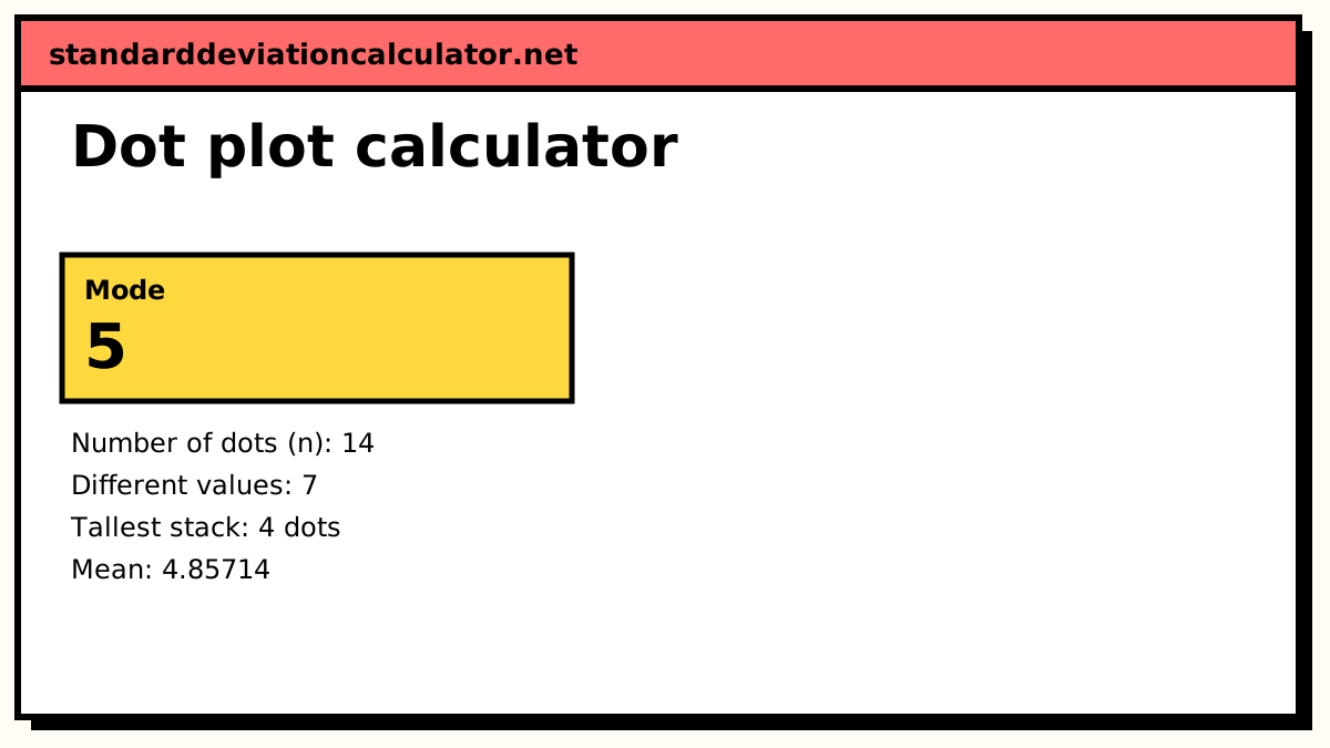
- Mode: 5, the tallest stack with four dots.
- Median: with 14 dots, the 7th and 8th dots from the left are both 5, so the median is 5.
- Mean: (2 + 6 + 12 + 20 + 12 + 7 + 9) ÷ 14 = 68 ÷ 14 = 4.857.
- Range: 9 − 2 = 7.
Reading the shape
The stacks rise to a peak at 5 and fall away on both sides, so the shape is roughly symmetric. The right side reaches further (to 9), but the left side holds more dots: six values below 5 and only four above it. Measured from 5, the dots on the left add up to −10 and those on the right to +8, so the balance point sits 2 ÷ 14 below 5, at 4.857. On a strongly right-skewed dot plot the mean would sit clearly to the right of the median.
Look for three things: where the tallest stacks are (the centre), how far the dots spread (the variability), and anything unusual, such as gaps, separate clusters or a dot far from the rest. With Q1 = 4 and Q3 = 6, the upper fence is 6 + 1.5 × 2 = 9, so the 9 sits exactly on the fence and just misses being an outlier. A dot plot is where values like that show up first.
Common mistakes
- Spacing the values unevenly. The axis is a number line, so 7 and 9 must be twice as far apart as 6 and 7, even when nothing sits at 8.
- Leaving out values with no dots, which hides gaps in the data.
- Using dots of different sizes or uneven stacking, which makes stack heights hard to compare.
- Plotting decimal data without rounding, which gives a flat row of single dots that shows no shape.
Common questions
What is a dot plot?
A number line with one dot for every observation, stacked above its value. The height of each stack is the frequency of that value, so the plot is a frequency table drawn as a picture. Some textbooks call it a line plot.
How do I find the mode, median and range from a dot plot?
The mode is the value with the tallest stack. The median is the middle dot counted from either end: with 14 dots it is the average of the 7th and 8th. The range is the rightmost value minus the leftmost. In the default plot these are 5, 5 and 9 − 2 = 7.
When should I use a dot plot instead of a histogram?
For small data sets with a limited number of distinct values, such as counts, scores or ratings. Every observation stays visible, so you can see exact values, clusters and gaps. Past a few hundred values or with many different decimals, the stacks become unreadable and a histogram is the better choice.
What does the rounding box do?
It rounds every value to the nearest multiple of the number you type before plotting. Data such as 4.13, 4.28 and 4.41 would otherwise give three stacks of one; rounded to the nearest 0.5 they become 4, 4.5 and 4.5. Leave it blank to plot the values exactly.
Can a dot plot have more than one mode?
Yes. If two or more values share the tallest stack, the data is bimodal or multimodal and the calculator lists every one. If no value repeats, there is no mode.
Related calculators
-
Histogram maker
Group larger data sets into bins instead of plotting every value.
-
Mode calculator
The most frequent value, with ties and frequency tables.
-
Stem-and-leaf plot
Another way to show every value while keeping its digits.