Pie chart calculator
Type each category and its value. The calculator turns them into percentages and central angles, lists where each slice starts and ends, and draws the pie chart.
| Category | Value | Fraction | Percent | Angle | Running angle |
|---|---|---|---|---|---|
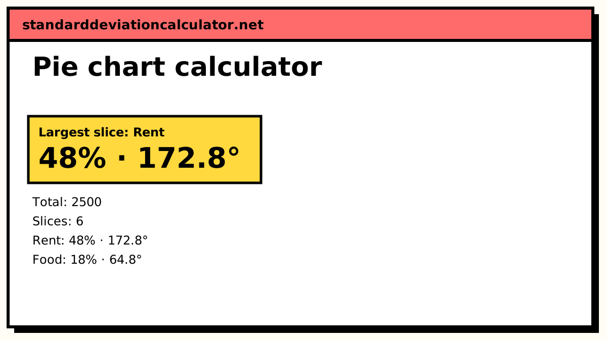
| 1. Rent | 1200 | 0.48 | 48% | 172.8° | 172.8° |
| 2. Food | 450 | 0.18 | 18% | 64.8° | 237.6° |
| 3. Transport | 250 | 0.1 | 10% | 36° | 273.6° |
| 4. Utilities | 150 | 0.06 | 6% | 21.6° | 295.2° |
| 5. Savings | 350 | 0.14 | 14% | 50.4° | 345.6° |
| 6. Other | 100 | 0.04 | 4% | 14.4° | 360° |
| Total | 2500 | 1 | 100% | 360° |
Show the working, step by step
Add the values to get the whole.
total = 1200 + 450 + 250 + 150 + 350 + 100 = 2500
Each category’s percentage is its value over the total, times 100.
Rent: 1200 ÷ 2500 × 100 = 48% Food: 450 ÷ 2500 × 100 = 18% Transport: 250 ÷ 2500 × 100 = 10% Utilities: 150 ÷ 2500 × 100 = 6% Savings: 350 ÷ 2500 × 100 = 14% Other: 100 ÷ 2500 × 100 = 4%
Its central angle is the same fraction of 360°.
Rent: 1200 ÷ 2500 × 360° = 172.8° Food: 450 ÷ 2500 × 360° = 64.8° Transport: 250 ÷ 2500 × 360° = 36° Utilities: 150 ÷ 2500 × 360° = 21.6° Savings: 350 ÷ 2500 × 360° = 50.4° Other: 100 ÷ 2500 × 360° = 14.4°
Draw the slices one after another from 12 o’clock, clockwise; the running angle says where each slice ends.
angles add to 360°
The formulas
percentage = value ÷ total × 100 angle = value ÷ total × 360° = percentage × 3.6°
Both come from the same fraction, value ÷ total. The percentages add to 100 and the angles to 360°. If you are drawing the chart by hand, the running angle (the sum of all angles so far) tells you where to mark the edge of each slice without adding up rounding errors as you go.
A worked example
The default is a monthly budget of $2,500: rent $1,200, food $450, transport $250, utilities $150, savings $350 and other $100.
| Category | Value | Percent | Angle | Running angle |
|---|---|---|---|---|
| Rent | 1,200 | 48% | 172.8° | 172.8° |
| Food | 450 | 18% | 64.8° | 237.6° |
| Transport | 250 | 10% | 36° | 273.6° |
| Utilities | 150 | 6% | 21.6° | 295.2° |
| Savings | 350 | 14% | 50.4° | 345.6° |
| Other | 100 | 4% | 14.4° | 360° |
Rent, for example, is 1,200 ÷ 2,500 = 0.48 of the budget: 48%, and 0.48 × 360° = 172.8°, just under half the circle. The last running angle is exactly 360°, which is a quick check that nothing was missed.
Drawing it by hand
Draw a circle and a radius from the centre straight up to 12 o'clock. Place the protractor on that radius and mark 172.8° clockwise for the first slice. Instead of measuring 64.8° from the new line, measure the running angle, 237.6°, from the starting radius; that way a small error in one slice does not carry into the next. Label each slice or use a key, and give the chart a title that says what the whole is.
Interpreting a pie chart
A pie chart answers one question well: what share of the whole does each part take? Here rent alone is almost half of spending, and rent plus food is two-thirds (66%). It is poor at comparing categories of similar size: savings at 14% and food at 18% are hard to tell apart by eye, even though the difference is $100 a month. Use the table for exact comparisons, and a bar chart if comparing categories is the main point.
Pie charts from survey counts
With survey data you can skip the percentages. If 60 people answered, each person is worth 360° ÷ 60 = 6°, so an answer chosen by 15 people gets 15 × 6° = 90°, a quarter of the circle. Enter the counts as values and the calculator does the same thing: the fraction is 15 ÷ 60 = 0.25 either way. This shortcut is handy for checking hand-drawn charts, because every angle has to be a whole multiple of 6°.
Common mistakes
- Multiplying by 100 instead of 360 when finding angles.
- Rounding each angle before drawing, so the slices do not quite close the circle.
- Mixing categories that overlap, such as “students” and “female students”; the parts of a pie must not share members.
- Leaving out a category, so the total is not really the whole.
Common questions
How do you calculate the angles for a pie chart?
Divide each value by the total and multiply by 360°. A category worth 450 out of 2,500 gets 450 ÷ 2,500 × 360° = 64.8°. The angles of all the slices add to 360°, give or take rounding.
How do I turn a percentage into degrees?
Multiply the percentage by 3.6, since 100% is 360°. So 25% is 90°, 10% is 36° and 48% is 172.8°. To go the other way, divide the angle by 3.6.
What if my percentages do not add up to 100?
Enter the raw values, not rounded percentages, and the calculator divides by their actual total. If you only have percentages that add to 99 or 101 because of rounding, entering them as values still works: each slice is its share of whatever the entries add up to.
Can a pie chart show negative numbers?
No. A pie chart shows parts of one whole, and a part cannot be less than nothing. Data with negative values, such as profit and loss, needs a bar chart instead. Zero values are allowed but get no slice.
How many slices is too many?
Beyond about six or seven, small slices become hard to compare and label. Combine the smallest categories into “Other”, or use a bar chart, which makes small differences easier to see.
Related calculators
-
Percentage calculator
Percent of, percent change and what percent one number is of another.
-
Relative frequency
Shares of a total as decimals and percentages, with a bar chart.
-
Frequency distribution
Count categories or values before charting them.