Box plot calculator
Paste one data set per line to draw box and whisker plots side by side. The calculator finds each set's quartiles, IQR and fences, marks the outliers and shows the working.
Put each data set on its own line, optionally starting with a name and a colon. Values can be separated by commas or spaces.
Each box runs from Q1 to Q3 with a line at the median; ◇ marks the mean. Whiskers stop at the last value inside the fences, Q1 − 1.5 × IQR and Q3 + 1.5 × IQR, and black dots are outliers beyond them.
| Set | n | Min | Q1 | Median | Q3 | Max | IQR | Fences | Outliers |
|---|---|---|---|---|---|---|---|---|---|
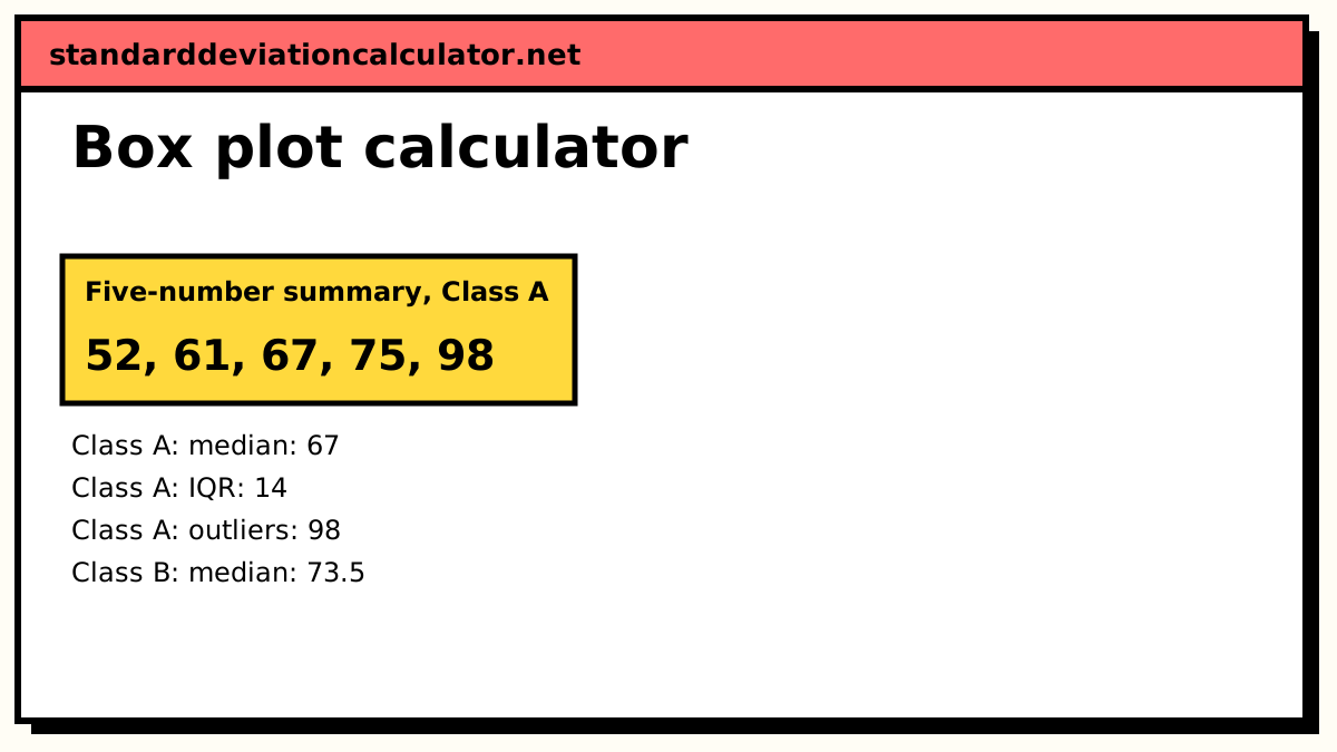
| Class A | 11 | 52 | 61 | 67 | 75 | 98 | 14 | 40 to 96 | 98 |
| Class B | 12 | 45 | 67 | 73.5 | 81.5 | 88 | 14.5 | 45.25 to 103.25 | 45 |
Show the working, step by step
Sort Class A (n = 11).
52, 58, 61, 64, 65, 67, 70, 72, 75, 78, 98
Find the median and quartiles. Q1 is the median of the lower half and Q3 the median of the upper half; with an odd n the median itself is left out of both halves.
Q1 = 61, median = 67, Q3 = 75
The interquartile range is the width of the box.
IQR = Q3 − Q1 = 75 − 61 = 14
Tukey’s fences sit 1.5 IQR outside the box.
lower fence = 61 − 1.5 × 14 = 40 upper fence = 75 + 1.5 × 14 = 96
Values outside the fences are outliers: 98. The whiskers stop at the most extreme values inside.
whiskers: 52 to 78
The other data set is worked the same way. 2 outliers in total.
The formulas
IQR = Q3 − Q1 lower fence = Q1 − 1.5 × IQR upper fence = Q3 + 1.5 × IQR
The box covers the middle half of the data. The fences are not drawn; they decide where the whiskers stop. A value below the lower fence or above the upper fence is an outlier and is drawn on its own. A value more than 3 × IQR outside the box is sometimes called an extreme outlier, and the table marks those with an asterisk.
A worked example
The default compares test scores from two classes. Class A has 11 scores:
52, 58, 61, 64, 65, 67, 70, 72, 75, 78, 98
With n = 11 the median is the 6th value, 67. Leaving it out, the lower half is 52, 58, 61, 64, 65, whose median is Q1 = 61. The upper half is 70, 72, 75, 78, 98, so Q3 = 75. The IQR is 75 − 61 = 14.
lower fence = 61 − 1.5 × 14 = 40 upper fence = 75 + 1.5 × 14 = 96
No score is below 40, so the left whisker runs down to the minimum, 52. The score of 98 is above 96, so it is an outlier, and the right whisker stops at 78, the highest score inside the fence. The mean is 760 ÷ 11 = 69.09, a little above the median because the 98 pulls it up.
Class B has 12 scores, so the median is the average of the 6th and 7th values: (73 + 74) ÷ 2 = 73.5. The halves have six values each, giving Q1 = (66 + 68) ÷ 2 = 67 and Q3 = (80 + 83) ÷ 2 = 81.5, so IQR = 14.5. The lower fence is 67 − 21.75 = 45.25, which makes the score of 45 an outlier, and the left whisker stops at 60.
Reading the plot
Class B's median is 6.5 points higher than Class A's, while the two boxes are almost the same width (14 and 14.5). So the classes have a similar spread in the middle, and B is shifted up. Each class has one outlier, on opposite sides: a high score in A and a low score in B. Those single students would move the means noticeably but barely move the medians, which is one reason box plots use the median.
The position of the median inside the box shows skew. In Class A the median is closer to Q1 than to Q3 (6 points against 8), a slight right skew. When one whisker is much longer than the other, the data has a long tail on that side.
Choosing a quartile method
The three options give the same median but can give different quartiles on small data sets. For Class A, linear interpolation (Excel's QUARTILE.INC and R's default) puts Q1 at position 1 + 10 × 0.25 = 3.5, halfway between 61 and 64, so Q1 = 62.5 and Q3 = 73.5. The fences move with them. None of the methods is wrong; use the one your textbook, teacher or software uses, and say which one when you report the results.
Common mistakes
- Forgetting to sort the data before picking out the median and quartiles.
- Running the whiskers to the minimum and maximum when there are outliers. The whisker ends at the last value inside the fence, not at the fence itself.
- Drawing groups on separate axes with different scales, which makes a fair comparison impossible.
- Reading the box as holding half of the values on each side of the median. Each of the four sections (whisker, half box, half box, whisker) holds about a quarter of the data, whatever its length.
Common questions
How do you make a box plot?
Sort the data and find the five-number summary: minimum, Q1, median, Q3 and maximum. Draw a box from Q1 to Q3 with a line at the median. Work out the fences, Q1 − 1.5 × IQR and Q3 + 1.5 × IQR, then draw whiskers from the box out to the most extreme values that are still inside the fences. Any value beyond a fence is plotted as a separate point.
Why does my box plot differ from my calculator or textbook?
Quartiles have several definitions. The TI-84 and most school textbooks take the median of each half and leave the overall median out when n is odd. Excel's QUARTILE.INC interpolates. For Class A in the example the first method gives Q1 = 61 and Q3 = 75, the second gives 62.5 and 73.5. Pick the method your course uses from the menu.
Do the whiskers go to the minimum and maximum?
Only when there are no outliers. In a modified box plot, the kind most software draws, the whiskers stop at the last data value inside the fences. In the example, Class A's maximum is 98 but its whisker stops at 78, because 98 is above the upper fence of 96.
How do I compare two box plots?
Compare the medians first (the centre), then the box widths (the IQR, or spread of the middle half), then the whiskers and outliers. If the box of one group sits mostly above the other's median, the difference is large relative to the spread. Put both groups on one axis, as this calculator does, so the comparison is fair.
What is the diamond on the plot?
The mean. It is not part of a standard box plot, but it shows skew at a glance: a mean pulled toward one whisker away from the median points to a long tail or an outlier on that side.
Related calculators
-
Five-number summary
The five numbers behind a box plot, for a single data set.
-
IQR & outliers
The interquartile range and Tukey fences in more detail.
-
Quartile calculator
Q1, Q2 and Q3 by several methods, with the working.