Scatter plot maker
Paste your x-y pairs and get a scatter plot with labelled axes. Switch on the trend line to add the least-squares equation, the correlation r and R², and a flag on any point that sits unusually far from the line.
One point per line: x and y separated by a comma, space or tab. Pasting two columns from a spreadsheet works.
Commas, spaces or new lines.
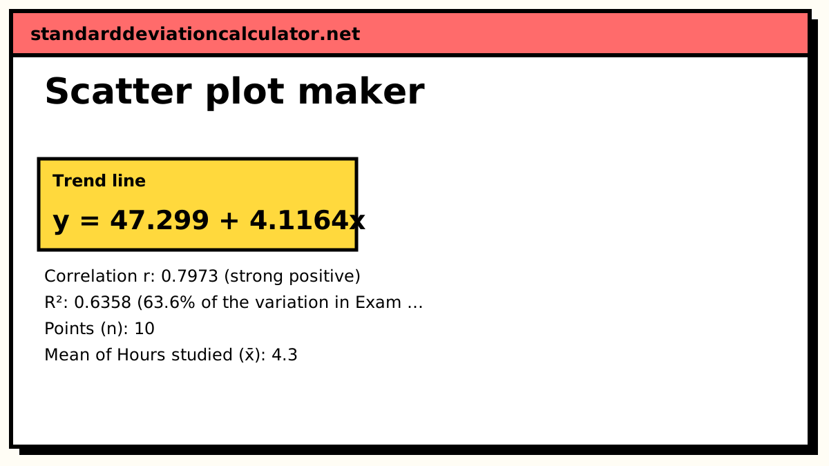
━ Students ━ Trend line y = 47.299 + 4.1164x
| # | Hours studied | Exam score | Predicted ŷ | Residual y − ŷ | Residual ÷ sₑ | Flag |
|---|---|---|---|---|---|---|
| 1 | 1 | 52 | 51.416 | 0.5842 | 0.0765 | |
| 2 | 2 | 55 | 55.532 | −0.53222 | −0.0697 | |
| 3 | 2 | 61 | 55.532 | 5.4678 | 0.716 | |
| 4 | 3 | 60 | 59.649 | 0.35135 | 0.046 | |
| 5 | 4 | 66 | 63.765 | 2.2349 | 0.293 | |
| 6 | 5 | 70 | 67.881 | 2.1185 | 0.277 | |
| 7 | 5 | 48 | 67.881 | −19.881 | −2.6 | outlier |
| 8 | 6 | 75 | 71.998 | 3.0021 | 0.393 | |
| 9 | 7 | 79 | 76.114 | 2.8857 | 0.378 | |
| 10 | 8 | 84 | 80.231 | 3.7692 | 0.493 |
Show the working, step by step
Find the means of x and y.
x̄ = Σx ÷ n = 43 ÷ 10 = 4.3 ȳ = Σy ÷ n = 650 ÷ 10 = 65
Sum the squared deviations and the cross-products.
Sxx = Σ(x − x̄)² = 48.1 Syy = Σ(y − ȳ)² = 1282 Sxy = Σ(x − x̄)(y − ȳ) = 198
Sample standard deviations divide by n − 1.
sₓ = √(48.1 ÷ 9) = 2.31181 s_y = √(1282 ÷ 9) = 11.935
Slope and intercept of the least-squares line.
b = Sxy ÷ Sxx = 198 ÷ 48.1 = 4.11642 a = ȳ − b·x̄ = 65 − 4.11642 × 4.3 = 47.2994
Correlation and R².
r = Sxy ÷ √(Sxx × Syy) = 198 ÷ √(48.1 × 1282) = 0.797349 R² = r² = 0.635766
Residual standard error, then flag any point whose residual is more than 2 sₑ from the line.
sₑ = √(Σ(y − ŷ)² ÷ (n − 2)) = √(466.948 ÷ 8) = 7.63993 2sₑ = 15.2799
A point more than 2 residual standard errors from the line is worth checking: it may be a typing error, an unusual case, or a sign that a straight line is the wrong model.
The trend line
y = a + bx, b = Σ(x − x̄)(y − ȳ) ÷ Σ(x − x̄)², a = ȳ − b·x̄ r = Σ(x − x̄)(y − ȳ) ÷ √[Σ(x − x̄)² × Σ(y − ȳ)²], R² = r²
The least-squares line is the one that makes the sum of squared vertical distances from the points as small as possible. It always passes through the point of means (x̄, ȳ). A residual is a point's vertical distance from the line, y − ŷ, and the residual standard error sₑ = √(Σ(y − ŷ)² ÷ (n − 2)) is their typical size.
Worked example
The default data are hours studied (x) and exam score (y) for ten students: (1, 52), (2, 55), (2, 61), (3, 60), (4, 66), (5, 70), (5, 48), (6, 75), (7, 79) and (8, 84).
- Means: x̄ = 43 ÷ 10 = 4.3 hours and ȳ = 650 ÷ 10 = 65 marks.
- Sums of squares: Σ(x − x̄)² = 48.1, Σ(y − ȳ)² = 1,282 and Σ(x − x̄)(y − ȳ) = 198.
- Standard deviations: sₓ = √(48.1 ÷ 9) = 2.312 hours and sy = √(1,282 ÷ 9) = 11.94 marks.
- Slope b = 198 ÷ 48.1 = 4.116 and intercept a = 65 − 4.116 × 4.3 = 47.30, so the line is y = 47.30 + 4.116x.
- r = 198 ÷ √(48.1 × 1,282) = 0.797, a strong positive correlation, and R² = 0.636.
Each extra hour of study goes with about 4.1 more marks on average. The residual standard error is 7.64, so 2sₑ = 15.28. The student at (5, 48) is predicted to score 47.30 + 4.116 × 5 = 67.88 and actually scored 48, a residual of −19.88, or −2.60 sₑ. That is the one flagged point. Take it out and r rises to 0.988 with R² = 0.976, which shows how much a single unusual case can drag on the correlation in a small sample.
How to read a scatter plot
Look for five things, roughly in this order.
- Direction. Points rising from left to right show a positive association; falling points show a negative one.
- Form. Do the points follow a straight band, a curve, or no pattern at all? r and the straight trend line only describe the straight-line part.
- Strength. The tighter the points hug a line, the stronger the relationship. As a guide, |r| above 0.7 is strong and below 0.3 is weak.
- Outliers. A point far from the overall pattern can be a data-entry error or a genuinely unusual case. Check which before deciding what to do with it.
- Clusters. Separate clumps often mean two groups are mixed together, such as two classes or two machines, and each group may have its own trend.
Correlation is not causation
A clear pattern shows that two variables move together, not that one drives the other. The link can run the other way, or a third variable can drive both: students who study longer may also sleep better or have more support at home. Ice-cream sales and drownings both rise in summer, but heat is the common cause. Only a controlled experiment, or careful reasoning about confounders, can support a causal claim.
When to add a trend line
Add the least-squares line when the points form a roughly straight band and you want to summarise the rate of change or make a rough prediction inside the range of your x values. Leave it off when the pattern is clearly curved, when the data fall into separate clusters, or when you only want to show the raw data. Do not extend the line far beyond the smallest and largest x: the trend may not hold there. With only two points the line fits them exactly and tells you nothing about the fit.
Common mistakes
- Swapping the axes. The regression of y on x is not the same line as x on y, although r is the same either way.
- Reading r = 0 as “no relationship”. A strong U-shaped pattern can have r close to zero.
- Deleting flagged points without a reason. Remove a point only if it is a proven error or clearly belongs to a different population, and say so.
For a significance test on r, use the correlation coefficient calculator; for standard errors and predictions, the linear regression calculator; to study every residual, the residual calculator; and for the unscaled measure of joint spread, the covariance calculator.
Common questions
How do I make a scatter plot?
Put the variable you think does the explaining on the x-axis and the one that responds on the y-axis, then draw one dot per case at its (x, y) position. Here you type or paste the pairs, add axis labels, and the plot, trend line and summary numbers appear straight away.
Can I paste data from Excel or Google Sheets?
Yes. Choose “Paste x, y pairs”, copy two adjacent columns and paste them in. Each line becomes one point; tabs, commas and spaces all work as separators. Lines that do not hold exactly two numbers, such as a header row, are skipped and counted in a note.
What does R² mean on a scatter plot?
R² is the share of the variation in y that the straight line accounts for. In the default data R² = 0.636, so the line explains about 64% of the spread in exam scores; the other 36% is scatter around the line. For a straight-line fit R² is simply r squared.
Which points count as outliers?
The tool flags any point whose residual (its vertical distance from the line) is more than twice the residual standard error sₑ. That is a rule of thumb, not a test: a flagged point deserves a second look, not automatic deletion.
Why does it refuse data where every x is the same?
If every x is identical the points form a vertical stack. There is no spread in x to relate y to, the slope would need a division by zero, and r is undefined. Enter points with at least two different x values.
Related calculators
-
Correlation coefficient calculator
Pearson’s r with a significance test and confidence interval.
-
Linear regression calculator
Slope, intercept, standard errors and predictions for y on x.
-
Residual calculator
Every residual y − ŷ, the sum of squares and a residual plot.