Aspect ratio calculator
Enter a width and height to get the simplified aspect ratio, resize to a new width or height without distorting, or work out a screen’s pixels per inch.
Show the working, step by step
Divide both sides by their greatest common divisor.
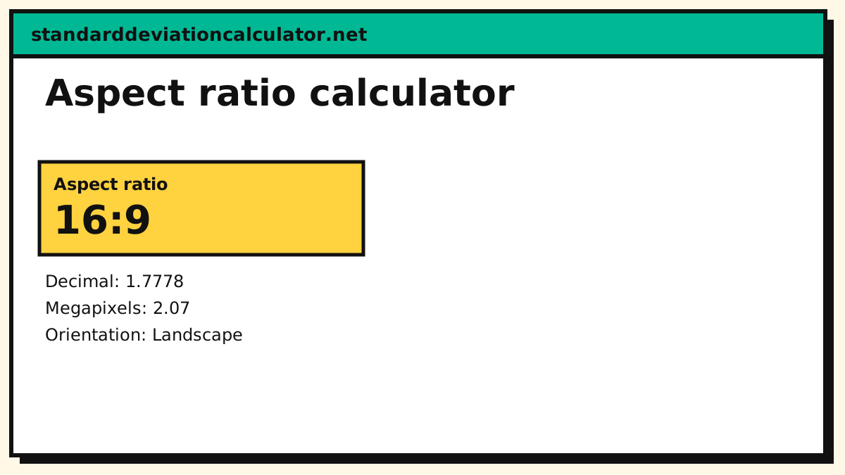
GCD(1920, 1080) = 120 → 16:9
How an aspect ratio works
ratio = width : height ÷ GCD(width, height) new height = new width × height ÷ width
1920 × 1080 divides by 120 to give 16:9. Common ratios: 16:9 video and monitors, 4:3 older screens and some cameras, 3:2 photography, 1:1 social squares. PPI = √(w² + h²) ÷ screen diagonal.
How to use the aspect ratio calculator
Choose a calculation. Aspect ratio from a width and height reduces the two numbers to their simplest ratio. Resize keeping the ratio takes your original width and height, asks whether you know the new width or the new height, and gives the other. Pixels per inch takes the resolution and the screen diagonal in inches and returns the pixel density. Enter whole pixels, or any units for the ratio.
How the ratio is found
Divide both numbers by their greatest common divisor. For 1920 × 1080 the GCD is 120, giving 16 : 9. For 1024 × 768 it is 256, giving 4 : 3. When the GCD is 1, as with 1366 × 768, the exact ratio is 683 : 384, and the nearest common ratio, 16 : 9, is a close approximation.
Resizing without distortion
new height = new width × original height ÷ original width
To scale a 1920 × 1080 image to a width of 1280, the height is 1280 × 1080 ÷ 1920 = 720. A 4 : 3 photo at 1024 × 768 resized to a width of 800 becomes 600 high. If the result is not a whole number, such as 1280 × 3 ÷ 4 = 960, which is whole, but 1000 × 9 ÷ 16 = 562.5, round to the nearest pixel and accept a tiny change in shape, or crop.
Common aspect ratios
| Ratio | Typical use | Example size |
|---|---|---|
| 16 : 9 | HD and 4K video, most monitors, YouTube | 1920 × 1080 |
| 4 : 3 | Older screens, iPad, some cameras | 1024 × 768 |
| 3 : 2 | 35 mm photographs, many cameras | 3000 × 2000 |
| 16 : 10 | Some laptops and monitors | 1920 × 1200 |
| 1 : 1 | Square social posts | 1080 × 1080 |
| 9 : 16 | Vertical video, stories and shorts | 1080 × 1920 |
| 21 : 9 | Ultrawide monitors, cinema-style | 2560 × 1080 |
Pixel density (PPI)
Pixels per inch measures sharpness: PPI = √(width² + height²) ÷ diagonal. A 27-inch monitor at 2560 × 1440 has √(2560² + 1440²) ÷ 27 = 2937 ÷ 27 = 108.8 PPI, while a 27-inch 4K screen reaches about 163. Phones sit at 400 PPI or more. Higher density makes text and images smoother at the same viewing distance.
Example
You have a 3000 × 2000 photo and want it as a 1200 pixel wide web image. The ratio is 3 : 2 (the GCD is 1000). Resizing to a width of 1200 gives a height of 1200 × 2000 ÷ 3000 = 800. For a 1080 pixel wide video frame in 16 : 9 the height is 607.5, so use 1080 × 608 or crop to 1080 × 606, whichever your editor allows. Many video codecs want even dimensions, so round to a multiple of 2 or 8.
Fitting one ratio inside another
When a 16 : 9 video is shown on a 4 : 3 screen, it fills the width and leaves bars above and below (letterbox). A 4 : 3 video on a 16 : 9 screen leaves bars at the sides (pillarbox). To avoid bars you must crop, losing part of the picture, or stretch, which distorts it. The calculator’s resize mode gives the scaled size that fits one side; compare it with the screen to see how large the bars will be.
Ratio versus resolution
The aspect ratio describes shape, not sharpness. 1280 × 720 and 3840 × 2160 are both 16 : 9, but the second has nine times as many pixels. When resizing for print, aim for at least 300 pixels per inch, so a 6 × 4 inch print wants 1800 × 1200 pixels. A screen is judged with PPI, described above.
Social media image sizes
Platforms change their recommendations often, so check the current size before exporting. As a rule: feed posts work well at 1 : 1 (1080 × 1080) or 4 : 5 (1080 × 1350), stories and short videos at 9 : 16 (1080 × 1920) and link previews at about 1.91 : 1 (1200 × 628). Enter your design size to confirm the ratio, then resize to the pixel width the platform recommends.
Practical tips
- Keep the ratio of an image when you resize it, or it will look stretched or squashed.
- Use a platform’s recommended ratio for uploads so that nothing important is cropped.
- When the destination ratio differs, crop rather than stretch.
- Remember print sizes: a 3 : 2 photo fits 6 × 4 in, but needs cropping for 5 × 7 in.
Common mistakes
- Swapping width and height. 16 : 9 is landscape, 9 : 16 is portrait.
- Resizing only one side. Changing just the width distorts the picture.
- Mixing up diagonal and width. Screen sizes are quoted as the diagonal.
Common questions
How do you calculate an aspect ratio?
Divide both the width and height by their greatest common divisor: 1920 × 1080 → 16:9.
How do I resize an image without stretching it?
Scale both sides by the same factor: new height = new width × original height ÷ original width.
What is PPI?
Pixels per inch: the diagonal length in pixels divided by the diagonal in inches. A 27-inch 2560 × 1440 screen is about 109 PPI.
How do I find the aspect ratio of an image?
Divide the width and height by their greatest common divisor. 1600 × 900 divides by 100 to give 16 : 9.
How do I resize an image and keep its proportions?
Multiply the new width by the original height and divide by the original width. 1280 × 1080 ÷ 1920 = 720.
What is the aspect ratio of 1920 × 1080?
16 : 9. So are 1280 × 720, 2560 × 1440 and 3840 × 2160.
What is the aspect ratio of a phone screen?
Most modern phones are around 19.5 : 9 or 20 : 9 in portrait, which is taller than the 16 : 9 of older models.
Related calculators
-
GCD and LCM
The reduction step.
-
Rectangle and square
Area and diagonal.
-
Ratio and proportion
Scale and solve.
-
Unit converter
Inches and mm.